
Lessons in Growth Design 3
How Testing Interactions and Metadata Increased Reading Time
This is the third part in my ongoing series: Lessons in Growth Design. Check out the first part from series here.
I work as a designer on the Wattpad Growth Team and we focus on increasing three metrics: retention, reading time, and sign ups (conversions). We know that the more a user reads on our platform, the more likely we are going to retain them. During my time designing on the team, I've worked on many projects to increase those numbers. I've started to document lessons learned from some of the key projects in an ongoing series called Lessons in Growth Design.
To carousel or not to carousel?
Wattpad has come a long way over the last few years, especially on mobile. Our mobile apps started out with only web views, which was choppy at the best of times. Since then we’ve made the apps native with the exception of a few help pages. Even more recently, we’ve launched a major redesign of our iOS app but the carousel design remained. Usually with overhauls there are some lingering designs that don’t get attention and for us that was the carousel discovery mechanism. For this redesign, the goal was to clean up the interface, add delightful micro-interactions, and change the navigational structure to the app.
People argue that carousels are a terrible, frustrating user experience. Being the growth team, we wanted to test if that was true for us. It was especially important to make our story discovery mechanism the best that it could be since we knew that increasing reading time is directly correlated to an increase in retention.
Unfortunately due to time constraints on the redesign we were only able to test this once it was already out in the wild.
We used the outside research on carousels to hypothesize that users were frustrated with the not having the best stories surfaced for them.

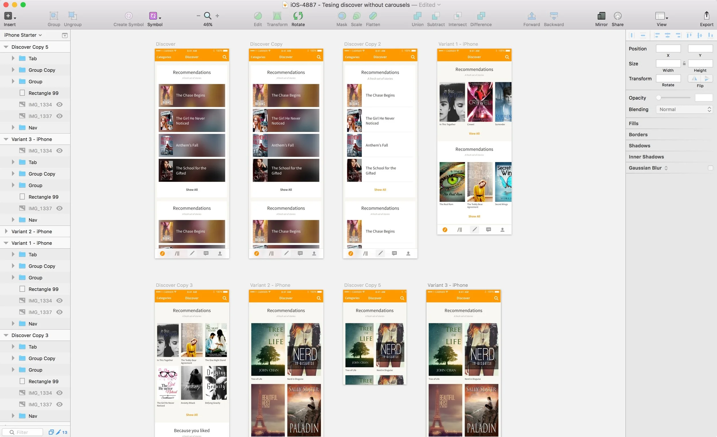
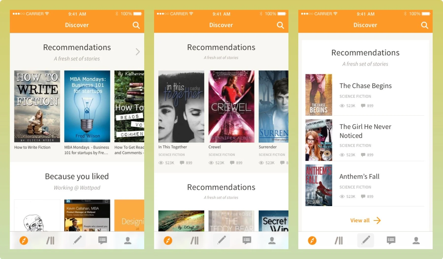
I started working on different interactions a user could take to find stories on the discover experience. I narrowed it down to two simple scroll variations to test against our control - the original carousel design without metadata. Some of my other variations reimagined how we actually displayed metadata but because that would potentially be a new variant that skews the results I opted to use the existing way we displayed metadata.

The mockups quickly highlighted some issues. The list view looked empty, and could use more metadata to fill out the design. However, adding metadata led to another problem - how would we know what caused a change in the numbers? Would it be the metadata or the interaction?
Okay, so now we would need to test two list view variants: one with metadata and one without, then a grid view variant with metadata and without, and the original with metadata and without. Also, what metadata would we show? There’s a lot to choose from: reads, votes, comments, description, category, tags, author name, and number of parts. What to do with so many variations?
First experiment - original vs listview
The team discussed and we decided to split this up into a few different experiments. Experimenting takes a long time. There’s planning meetings, design, development, analysis, and reporting. We could have spent a lot of time testing every possible variation to get the results we needed but it would have taken too long. We also needed answers quickly because of another product feature soon to roll out that was dependent on the results.
After a rather lengthy debate, we started by putting our best foot forward with testing a list view with metadata and two carousel designs - one with and one without metadata. With these designs we could see if metadata and interactions would outperform the original design.
First experiment results

We got the results back and they were rather surprising. There was a HUGE lift in reading time and retention on both variants that included metadata; especially with new users. (56% increase in reading time overall; 27% lift in early retention for new users; 2.2% increase in retention for existing users.) The two variants with metadata beat the original design, but we opted to keep the carousel because it would be less intrusive to users and it kept dev effort low. We rolled out metadata in the carousel to 100% of users.
Second experiment - testing the metadata
The substantial lift we saw by adding metadata to the ‘discover’ page meant that we should focus our efforts on figuring out which metadata would have the most impact. How would we test the metadata? Each individually? What about the impact of combinations? What was the right combination? Because of the amount of potential variants we would have to run and because of the high amount of dev effort that would entail, we enlisted the help of our data science team and they used a Fractional Faction Design test with this experiment to determine the best set of metadata to show.
In doing so I had to create seven different variations to test against the original. Although this number of variants was higher than we’d like to test, it was the only way. Luckily, the design for each wasn’t that different so dev time was low.
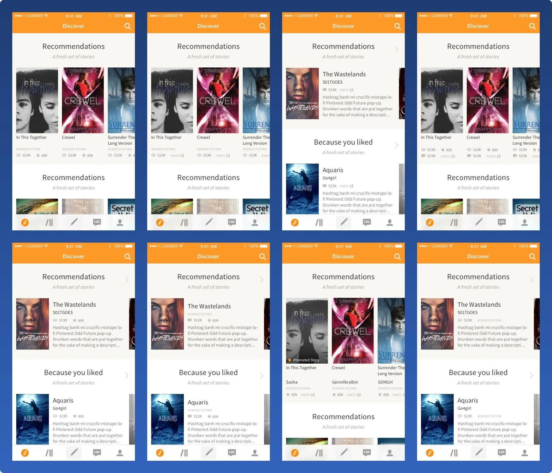
The results of this part of the experiment showed an overall improvement in reading time by about 40% for all the variations that had metadata vs the original set of metadata. We thought for years users wanted number of reads, votes, and comments in that order but boy were we off. The results showed that next to the story cover and title, users valued number of chapters a.k.a parts, short description, category, and then read count, and vote count. There was a negative impact however on the variations that included the author name and number of comments. Number of comments had a negative impact. Who would have guessed?

Third and final experiment - coming full circle
The first and second experiment were run about a year ago. Since then our core product team has redesigned the way we discover content on our platform. Because this was a high priority, we held off on running another experiment that would determine once and for all if carousels designs were right for us. Now that we know the right metadata to show on the story discovery level, would that change the result of testing carousels vs a non-carousel design? We plan on finding out.
What I would do differently now
When we first ran this set of experiments I spent a lot of time debating about the right way to run it. A lot of variants at once or split up. Looking back, we learned to put our best foot forward. The faster we tested the quicker we saw gains and learn how to move forward. An issue that came out of that for me was I would spend a lot of time designing something that didn’t get tested right away. By the time it did get tested the product changed enough that I had to revisit it.
Another thing I’m thinking about today is how what we believe the right metadata is overall might not always be applicable to every area of the app. Should it be different in search results? What about in a reading list? I would have liked to explore different iterations of metadata in different areas of the app. This is something we’re starting to look at now.
Key lessons from testing interactions and metadata:
1. Don’t only follow advice on what’s worked and what hasn’t worked on other products. Always test to see if that’s true for you.
2. The faster you test the quicker you’ll see gains
3. Planning ahead on how you’re going to run a series of experiments will save you lots of time with your designs. No more wasting effort on designs that won’t be tested for a while.
4. Ask yourself if what you’re testing is the same in other areas of the product. If you have the time, test to see how it differs.