
Lessons in Growth Design 1
How Testing Value Props On Landing Pages Increased Sign Ups
Acquiring users and keeping them engaged are the most important elements to any successful social platform. As a member of the Growth team at Wattpad, a huge part of my job involves creating different designs and testing them to see how they affect the rate of gaining and retaining users. With millions of readers and writers using the product, our goal is to constantly improve Wattpad’s existing experience in order to retain the loyalty of active users while also attracting new ones.
Before I get into case studies, I thought I’d share some background on why we became more data driven and what I learned as a Product Designer on the Wattpad growth team.
Data is king
Like most venture funded startups, we started small. As we scaled we realized that in order to accelerate user growth we had to get more granular with user tracking. Google Analytics was a good start but it wasn’t as flexible and precise as we needed so in conjunction with some third party tools, we developed our own set of internal systems that gave us greater flexibility and more granularity with A/B testing and user tracking. On the design team, we went from relying heavily on qualitative user research to a team that also used data to validate assumptions and inform design decisions. Soon after we created a growth team to focus on accelerating growth in our existing product.
What I learned moving from core product design to growth design
1. Start with the data. Having a hypothesis backed by data helps keep designs focused rather than just postulating on what to do next.
2. Use winning design patterns as the foundation for new experiments. Like a styleguide, it’s handy to keep a log of what worked and what didn’t work in the designs of previous experiments and use those as a starting point.
3. Design with a range of exploration. Each variation should have a purpose but by starting off with as many variations as you can think of based on the research, it leaves flexibility for narrowing it down to the best possible versions for testing.
4. Design small. If you design an experience with many changes it will be harder to uncover which change had the biggest impact when you look at the experiment results. Was it the interactions or the copy that led to an increase in the numbers? With each change we are able to make a more informed decision for the next iteration. Eventually, those small changes add up to something bigger.
5. Be even more conscious of time. As designers we have great instinct and believe firmly in our assumptions. Often that can lead to going overboard in a design - exploring, iterating, sketching, animating, convincing developers to put in more time because “trust me it’ll be worth it, the force is strong with this one.” Well…

Your assumptions will be proven wrong. By keeping it lightweight until results are in we are able to effectively manage our time and effort. Once our assumptions are validated we circle back to tweak the experience and further refine it.
The three things we focus on
The Wattpad Growth Team focuses on increasing three metrics: retention, reading time, and sign ups (conversions). We know that the more a user reads on our platform, the more likely we are to retain them. During my time designing on the team, I've worked on many projects to increase those numbers. I've started to document lessons learned from some of the key projects in an ongoing series called: Lessons in Growth Design.
Let’s get started…
Testing Value Props

We started with the web
If you visit our landing page - wattpad.com - we know if you sign up, log in, or leave the page. During our weekly brainstorm sessions the Growth Team comes up with ideas to improve signup ratings.

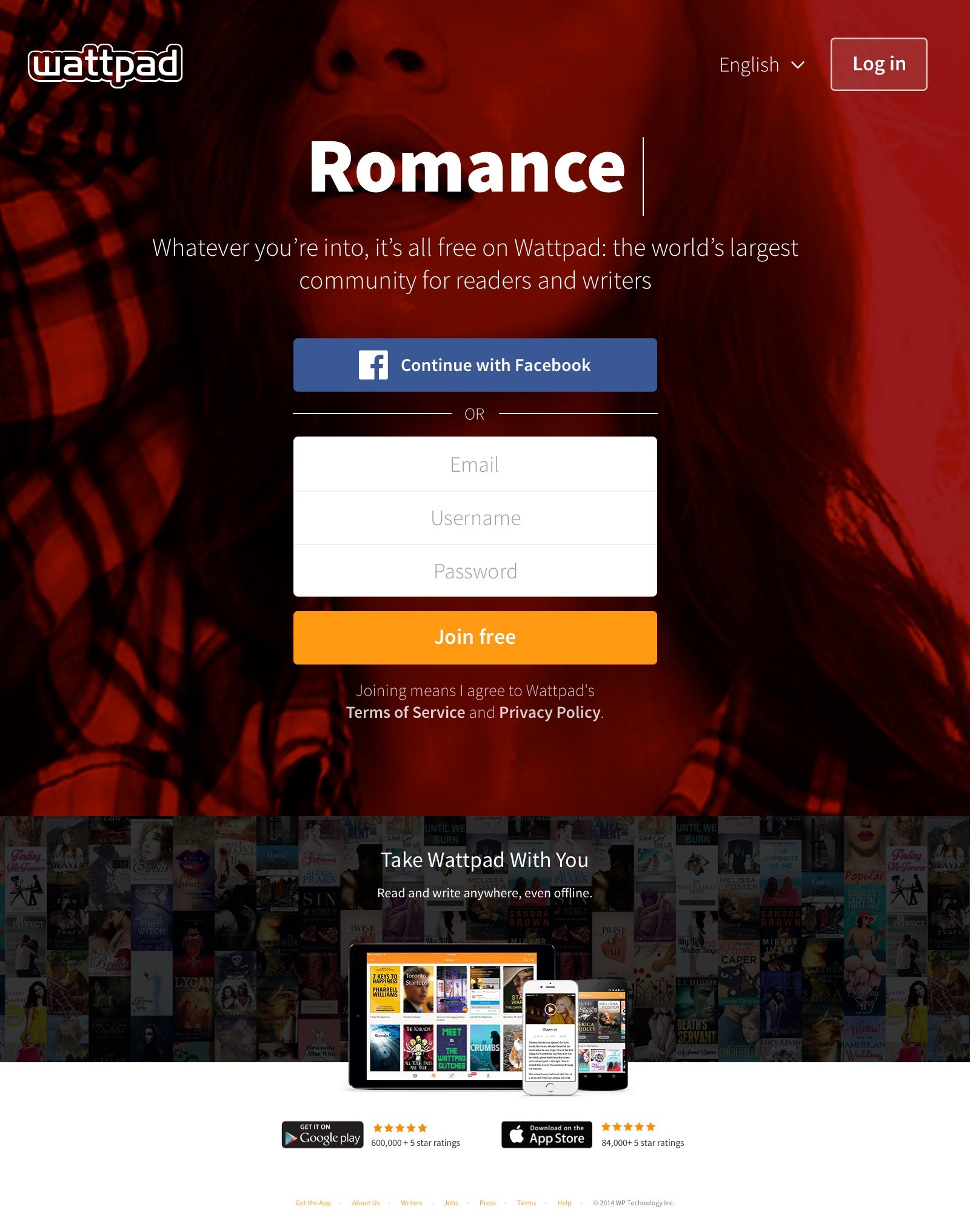
We always start by looking at past successes. Before we had a growth team, our marketing team ran an initiative with specialized landing pages for fan fiction, for romance, and for writers that performed well with conversions. In contrast to our current landing page that focused on a singular proposition, each one of these pages had multiple value props called out. Our current landing page (below) had been working okay for sign ups but we wanted to see if additional information like those on the specialized landing pages would convert better.
To save on dev effort, we borrowed some of the code from the specialized pages and rolled it out on web first. The designs from these specialized pages performed well enough that we kept the scope of this project to be more about finding the right value props rather than testing different interface designs.
How we got users to give us their info (shut up and take my email)

Telling someone that they can find anything to read on our site for free is a big sell, but there are other sites where someone can find content to read for free too. What could Wattpad do to stand out and make people want to sign up to use our product over the rest?
Research told us that users love reading from anywhere and the data backed that up. You gotta love the data.

Our retention is nearly double for our mobile users. Enter value proposition one:

Interviews and surveys also helped for narrowing down the second value prop. Users love engaging with others and with the stories themselves through likes and comments.

The third value proposition added was about keeping that content flowing. The majority of our users are readers, but the writers make our platform successful. More writers equal more content. ‘Try your hand at writing.’ This also let potential users know that anyone can write on our platform and find their audience. User interviews highlighted that writers prefer a desktop writing experience over a mobile one so showing a desktop visual would have more of an impact to potential writers.

We tried many variations on the copy and stuck with what performed best. We also tested the copy in different languages as well. Putting it all together this is what I ended up with:
We got the results back and we saw a nice lift in users signing up numbers AND higher retention.

Onto mobile
We allocated more time to this project because of how much of a lift we saw on the web, however, some changes were made on mobile. I began with a tweak to some of the original value prop copy. I removed the ‘Read from anywhere’ copy since there was no need to tell users to get the mobile app if they were already using it. Chatting with users in-house told us that on a mobile device they interpreted ‘Read from anywhere’ as they could read offline. So we changed the copy to ‘Discover and read your next favourite story, even offline.’ After testing more variations we also found that on mobile ‘Share your thoughts and interact with others’ and ‘Write your own story for millions to read, comment, and vote on’ outperformed the original web copy.
The second change was due to screen real estate. With less room on mobile, seeing all the value props at once would be problematic. To make all the value props more discoverable I needed a way to encourage users to keep swiping through the screens. Running a few in-house usability tests showed us users engaged more with interactive elements than static ones. Since Wattpad is all about stories, I came up with an idea to have the representation of a story an interactive element that moved between each value proposition.

Each element on the screen, especially the visual elements needed to be positioned just right so it could easily be adapted for multiple screen sizes.

Here's the final design we went with for mobile.
Some apps do their version of adding value propositions either before or after the sign up so we tested different variations to see what worked for us. The results showed that the variation after sign up did better than the one before the sign up. Here’s what the proposed variations looked like on Android.


“To assume is to presume” - Jude Morgan
We all presumed that the value propositions would do well on mobile because of the results on web, but in fact we saw an overall decrease in sign ups and retention. Why? All our research suggests that a vast amount of our mobile users already know what Wattpad is about when they download the app. They know about Wattpad through word of mouth, by reading the description it in the app store, or they come from our app on desktop. The value props added to the app was just a higher barrier to entry for new users, which also explains why the variation of value props after the signup did better. Our web users however have so many potential entry points that land them on our site so having value props adds context.
What I would do differently now
At the time, this experiment was one of the first we ran on our growth team so our project scope was limited. Now that we also have better testing tools in place, if we were to run this experiment today, I would also test more design variations. We put our best foot forward based on the designs from the specialized landing pages. While that did work we didn’t spend the time narrowing down if it was the optimal design.
Key lessons from testing value props:
1. Look at similar successes in your product and build on those ideas.
2. Reusing good existing code for an experiment is a great time saver.
3. Use the existing data to better understand what users love about your product and then promote that information to increase sign ups.
4. Web and mobile require different approaches to designing the same solution.
5. Users can respond differently on different platform so success on one does not necessarily mean success on another. Always test on different platforms.